Part Two: “Exit Through the Gift Shop”Applying theme park principles to corporate events.
11.21.2019
By Doug Binder, Sr. Creative Director, InVision Communications, with Jimmy Verrett, Sr. Creative Strategist/Sr. Creative Director, InVision Communications
Part Two: “Exit Through the Gift Shop”
Applying theme park principles to corporate events.
In our first post, we began to tell the journey of an attendee visiting a theme park, from the promise of its marketing and promotion to the threshold experience and finally the arrival. We offered some ideas for deploying these same time-tested concepts in similar stages of a corporate event experience – from invitation to entrance – to make a quick and lasting impact on attendees.
Now, let’s look at how parks are designed to help guests navigate the space, how disparate areas are connected and revealed, and how the slate of offerings encourage attendees to chart their own adventures. All of these notions can easily translate to events and deliver the same “magic” as their theme park counterparts. In essence, theme park navigation layouts can be compared to crafting compelling event customer journeys – ones that strategicallytake users from point A to point Z, with important stops along the way, each designed to impart their own unique experiences and take-aways.
Centers of Gravity
“I want to go there.”
Most theme parks employ an iconic centerpiece of architecture that serves as an often-colossal brand marker for that property: the Tree of Life at Orlando’s Animal Kingdom, Disney’s ubiquitous castles all over the world, one-third scale Eiffel Towers at Kings parks. Those Eiffel Towers, of course, were inspired by the real thing which was constructed for the 1889 World’s Fair in Paris. World’s Fairs actually inspired a number of enduring theme park icons, including the Ferris Wheel in Chicago in 1893, the Unisphere in New York in 1964 (you’re welcome, Universal Studios), and the geodesic dome in Montreal in 1967 (look familiar, EPCOT?).
Visible from a distance—particularly from the park’s entrance—these structures anchor the overall park layout, drawing attendees not only to the park but also giving them something to gravitate towards and around throughout their visit; the structures are key to navigation and orientation. And, of course, these centerpieces are among the most photographs structures on Earth.
Pro Tips:
• A defining piece of art/architecture is ideal for our Insta-driven world, where a few thousand share-outs can carry your event brand around the world while other platforms are still getting dressed.
• 3D is great, but murals and logo walls make a nicely branded splash.
• Consider hiring an artist or design firm to imagine the piece, and then save the fun of construction for attendees over the course of your event.
Most Disney parks are designed in the hub and spoke model; all roads lead to and from the center (i.e., the castle, sphere, lagoon), and they connect to one another along the circumference of a wheel. If your venue has the space to engineer something like this, consider padding the budget for your hub area and make it a place attendees want to return to for an intensified brand experience and kinetic interaction with others.
Journeys & Adventures
“Tell me a story. Tell me lots of them.”
Theme parks pretty much define “choose your own adventure.” In a single day you can be immersed in the worlds of pirates and wizards and arctic penguins and talking cars and valiant star travelers. Sometimes all at once! And don’t forget to make time for the simple thrills of speed, corkscrews and prolonged inversions – no story necessary.
An increasing number of event designers are embracing and enabling this self-directed model. By partitioning broad content objectives into consumable bits and bursts, they are delivering holistic experiences that are more compelling, resonant and enjoyable.
Of course, they’re also addressing the consumption behaviors of younger audiences.
Pro Tips:
• Use design to differentiate activations more distinctly. Group together related floor demos and turn them into a “land,” replete with a call to adventure. See our notes above on clever visual appeal.
• Up-level the breakout routine with simple adds like lighting, projections, signage and music that makes the journey feel like more than a series of sterile hotel hallways and conference rooms. See below for more ideas about exploiting every minute and step of the journey.
Constant Discovery
“It’s one ‘aha’ after another!”
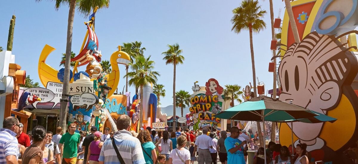
Theme park designers imagine every step of your trek through their properties, and they’ve engineered your journey – without you even knowing it – to be a series of reveals. The family turns a corner in Bavaria and suddenly finds itself in an African village; Fantasyland transitions into Tomorrowland; Skull Island gives way to Jurassic Park. It’s usually subtle but very intentional and wonderfully surprising. Imagine giving your attendees that same sort of constant discovery, from hall to hall, room to room and day to day.
Check back soon to see part 3 of our series, where we dive deeper into amusement park design to help inspire full brand immersion. If the anticipation is too much, like a kid waiting in line at Space Mountain, get in touch with us sooner to discuss ways to make your next corporate event the happiest place on earth. Contact us at info@iv.comto learn more!
Part One of Exit Through the Gift Shop
Part Three of Exit Through the Gift Shop


