Design Directions 2023
02.08.23
Trends are often passing fads, quick to emerge and just as fast to disappear. Design trends are no different. Colors, typefaces, images that are white hot become so last year and past their prime all too soon. By contrast, the following new directions we’re highlighting feel more long-lasting and significant. They’re prompted by new technologies, new ways of seeing ourselves and new ways to communicate. Our team of expert designers are excited to share how we integrate them into our work and process for our clients. Like 2020, 2021 and 2022, 2023 is going to be another year of change!
The advent of AI image generation
AI image generation is a rapidly developing technology that allows computers to generate images based on input data. You may have heard of the platforms, the most notable being Dall E, Mid Journey, and Stable Diffusion. The process is fairly straightforward and similar for all; the user inputs a list of visual attributes and the platform references millions of online sources to generate the artwork.
I use Mid Journey for concept artwork, mood boards and storyboarding, which allow to me to quickly refine and iterate at virtually no cost. It helps to make clearer, more accurate decisions on how the final piece will look.
There are a growing number of concerns about the proliferation of AI capabilities and how it impacts creativity, and the potential for copyright infringements. With the democratization of software, like the desktop publishing boom during the mid 80’s, similar fears arose in the design community that design was being devalued, but ultimately the virtues of desktop publishing were fleeting as the thinking, strategy and sensitivity that a design professional brings to the project were missing. Human oversight can also address concerns with copyrights, as will the development of additional controls within the technology to limit use. As with AI image generation, what seems to be an existential threat can turn out to be an extremely useful tool.
Kurt Finkbeiner
Art Director
The rise of cloud-based, mobile accessible, design app tools
Today, everyone is empowered to create anything and to publish anywhere. There is no design experience required to build elevated social media graphics or presentations with online apps like Canva and Adobe Express. These platforms include readymade templates, premium content, cloud storage and collaborative features for teams. Entry level subscriptions are available for free!
Is this new user-friendly software a threat to professional graphic designers? Nah, great design comes from great designers, not a tool. These are not the first programs to come out for non-designers. Microsoft Publisher and PowerPoint have included templates and clip art since the 1980s. Tools alone do not instill in someone the
expertise they need to do a particular job properly. Design is a discipline that requires creative thinking, an aptitude towards art, time and dedication. Understanding and applying the principles and theories of design is a craft.
How can your brand benefit from these modern design app tools? Design teams are now creating custom designed templates in Canva or Adobe Express for their marketing managers and other non-design team members to help build brand assets. Win win.
Steph Donlin
Design Director
Colorful optimism
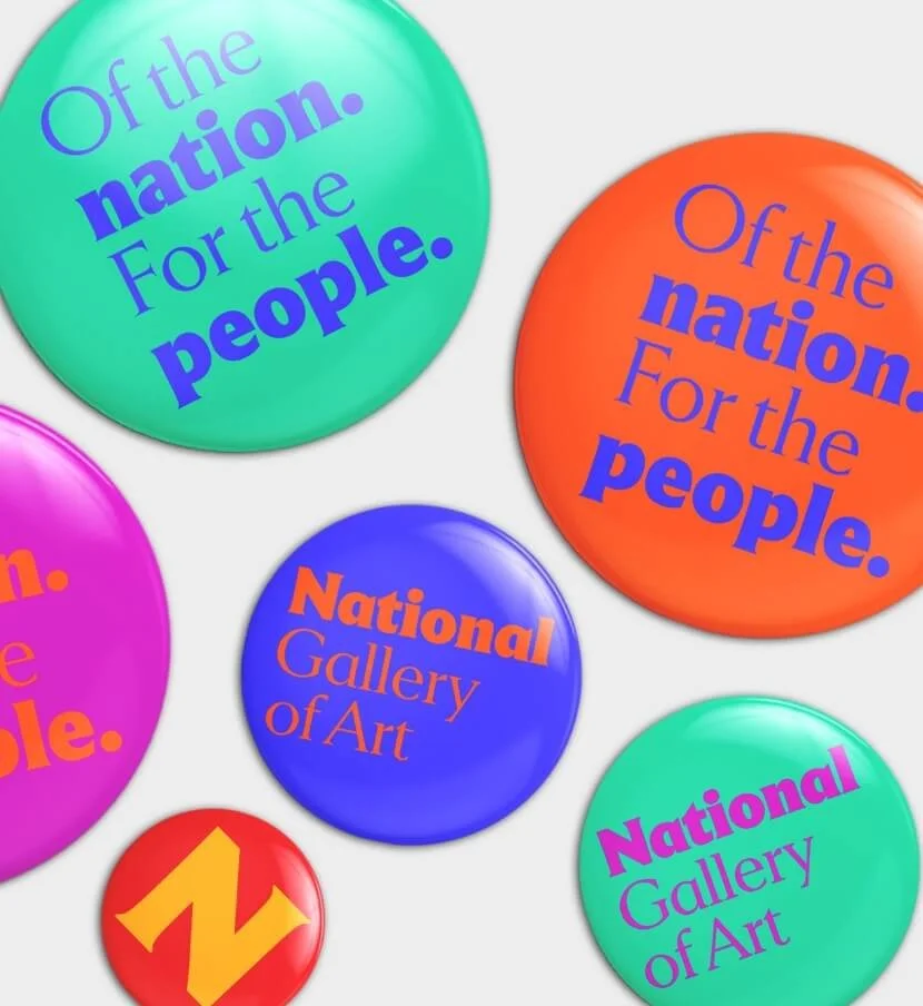
Bright colors, bold type, big impact. This trend is exactly what it says it is … distinct and hopeful. It symbolizes the end of the pandemic, and a desire for a positive direction delivered in a clear and unique way. This direction can be found in environments, packaging and online and industries as diverse as finance, food and technology. In every example the application stands out and delivers its
message with energy and warmth. With the return of live experiences and in-person programs, there are benefits to designing colorful and optimistic experiences: They are visually appealing, clearly understood and stand out to pull people back into the world of connection and engagement.
Jonathan Brown
VP, Design
Evolving infographics
From hieroglyphs, to maps, to bar charts—humans have been creating infographics for centuries. Over the past few decades our ability to show information is advancing from static images to moving interactive graphics. We can build richer, more immersive experiences to convey data in a more succinct, yet memorable way.
As technology advances, the access to digital tools is getting easier and less expensive. Programs such as Figma have a variety of templates and plug-ins for UX/UI interactions.
Vev makes it easier to create websites with scrollytelling (storytelling with motion via scrolling on a webpage). With Unreal Engine, you can build characters and 3D environment assets and produce a multitude of
experiences. Imagine creating assets into a virtual sandbox and then being able to generate multiple brand touchpoints to reach a variety of audiences. You can launch social media marketing, interactive websites, immersive AR and VR mobile games, informative wayfinding and captivating XR keynote messaging.
We are seeing a huge shift in how infographics are evolving from flat images to truly visually compelling interactions for a memorable experience and deeper audience connections.
Jane Wight
Senior Art Director
Importance of inclusive imagery in visual communications
Photography and imagery are incredibly powerful in conveying any message. What we show on screens is as important as the words spoken on stage. In 2019, Google conducted a diversity audit to ensure they were authentically representing their users and found they were falling short. They realized they had to update their marketing and communications to better reflect today’s world and to feature diverse individuals from a wide range of communities.
Google is not alone. Many other companies are making changes as well. In our industry, we partner with clients to communicate a vision, a message, to help them inform what’s to come, or to educate or train their employees, among many other services.
Our first question in the design thinking process often is: who is your audience? We are most successful when we create visual messaging that is representative of the audiences we serve.
To create authentic and inclusive messaging, we need representative teams. Our ability to reach diverse audiences lies within our own diversity as a company. There’s also variety within diversity. It is not enough to look for one common denominator. We have to look deeper within each audience segment and community to be successful in our visual messaging.


